Walk Free: Government Response Platform
UX/UI
Data Visualisation
Research
Stakeholder Management

Introduction
The Walk Free Government Response Platform is a critical component of the Global Slavery Index, designed to assess and rate government actions in combating modern slavery. This tool provides transparency, benchmarks progress, and informs policy recommendations globally.

As the UX Designer for the revised platform, I was responsible for redesigning the interface to enhance usability, accessibility, and overall user experience. Collaborating closely with the Product Owner and Researchers at Walk Free, we employed a user-centric approach to ensure the platform effectively serves they users.
Problem Statement
The previous iteration of the Government Response Platform faced several challenges:
Complex Navigation: Users struggled to find relevant data efficiently.
Lack of Visual Clarity: Key insights were buried in text-heavy reports.
Limited Engagement: The interface did not encourage interaction or deep exploration of data.
Our goal was to create a seamless, intuitive experience that made it easier for users to access, interpret, and leverage government response data in their work.
Research & Discovery

User Interviews: Engaged researchers to understand their pain points and workflows. These discussions provided insights into how users searched for and interpreted data, highlighting areas where the previous platform fell short.
Personas Development: Created detailed personas representing key users. Each persona was mapped with specific goals, pain points, and behavioural patterns to inform design decisions.
Competitive Analysis: Studied similar data-driven platforms to identify best practices in information architecture and visualisation. We examined platforms like Transparency International’s Corruption Perceptions Index and the World Bank’s Open Data Portal, which utilise clear data hierarchies, interactive elements, and filterable datasets.
Usability Heuristics: Applied best practices from Jakob Nielsen’s usability heuristics, ensuring intuitive design elements such as consistent navigation, visibility of system status, and error prevention mechanisms.
Data Visualisation Principles: Adopted Edward Tufte’s principles (Ref: The Visual Display of Quantitative Information), comparisons, causality, multivariate, integration, documentation, and context for clear and meaningful data representation, ensuring that complex statistics were distilled into digestible visual formats. We focused on minimising cognitive overload by using progressive disclosure, hover-over tooltips, and interactive filters to reveal deeper insights without overwhelming users.

Design Process
Wire-framing & Prototyping:
Developed low-fidelity wireframes to map out key interactions, ensuring an intuitive user flow.
Created multiple iterations based on stakeholder feedback to refine structure and content hierarchy.
Transitioned to high-fidelity prototypes incorporating brand guidelines and accessibility standards.
Used Figma as the primary design tool, enabling collaborative reviews and real-time feedback from the research team.
Information Architecture & Navigation:
Key UX/UI Enhancements:
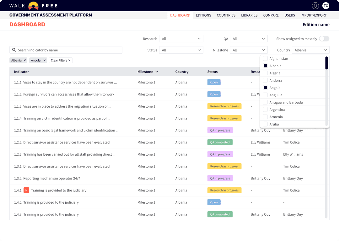
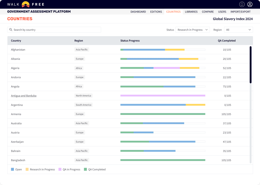
Improved Navigation: Developed a persistent menu and advanced search capabilities, enabling quick access to country-specific data and thematic areas.
Data Visualisation: Designed comparative tables to highlight trends and facilitate data interpretation.
Accessibility Considerations: Followed WCAG compliance standards, including colour contrast optimisation, keyboard navigability, and text alternatives for visual elements.
Consistent Design System: Established a modular design system to maintain visual consistency and support future scalability.


User Testing
Conducted multiple rounds of usability testing with internal researchers to validate key interactions and flows.
Gathered feedback through observational studies and direct user interviews to assess comprehension and ease of use.
Iteratively refined interface elements based on usability insights, ensuring a seamless experience aligned with researcher needs.
Challenges & Solutions

Balancing Detail with Simplicity: Government response data is complex, and presenting it in a digestible format was crucial. We introduced progressive disclosure techniques, allowing users to explore summaries before diving into full reports.
Ensuring Data Integrity & Clarity: Worked closely with researchers to maintain accurate representations of government responses while simplifying presentation for better comprehension.
Stakeholder Alignment: Frequent workshops and feedback sessions helped bridge the gap between UX best practices and research-driven content needs.
Outcome & Impact

Enhanced User Engagement: Improved navigation and visualisation led to increased interaction with the platform. Users spent more time exploring government responses, utilising filters and interactive comparisons to analyse data more effectively.
Improved Data Accessibility: Users reported finding key insights faster and with greater ease. The new search functionality and interactive data breakdowns significantly reduced the time required to locate relevant information.
Positive Stakeholder Feedback: Researchers found the redesign more intuitive and aligned with their needs.
Future Scalability: The flexible design system allows for ongoing enhancements and new feature integrations. For example, the modular structure enables the addition of new metrics and comparative tools without disrupting the user experience.
Conclusion & Learnings
This project reinforced the importance of a research-driven UX approach when working with complex data. By focusing on usability, accessibility, and intuitive information architecture, we significantly improved the experience for internal research teams.
One key learning was the necessity of iterative testing to validate design decisions. Early usability testing allowed us to refine interactions, ensuring that researchers could efficiently navigate and extract meaningful insights from the platform. Additionally, aligning UX strategies with data integrity was crucial, ensuring that visualisations simplified complexity without distorting the underlying research.
Moving forward, continual user feedback will be essential to refining the platform and expanding its impact within Walk Free’s research initiatives. By maintaining a flexible and scalable design system, the platform is well-positioned to evolve with new data trends and future research needs.
Reviews


Feel free to hit me up. I'm looking
forward to hearing from you.