Developing Data Visualization Guidelines at Minderoo

Project Overview
Minderoo Foundation is committed to using data to drive impactful decision-making. To enhance clarity, consistency, and effectiveness in data communication, the project aimed to develop comprehensive Data Visualisation Guidelines. These guidelines serve as a reference for internal teams, ensuring that visual representations of data are both accurate and accessible.
Problem Statement
Inconsistent and ineffective data visualisation practices across different teams led to:
Difficulty in interpreting insights due to lack of standardised visual formats.
Misrepresentation or oversimplification of complex data.
Accessibility and usability concerns, making it harder for diverse audiences to engage with data-driven narratives.
Objective
The goal was to establish a set of principles and best practices for designing clear, accurate, and engaging data visualisations. The guidelines would help researchers, designers, and communicators create visuals that align with best practices in data storytelling and accessibility.
Approach
Research & Benchmarking
Reviewed existing industry standards (e.g., Data Visualisation Society, Tufte’s principles, WCAG accessibility).
Analysed common visualisation challenges within Minderoo’s datasets.
Defining Key Principles
Accuracy & Integrity: Avoiding misleading representations.
Simplicity & Clarity: Making insights easy to interpret.
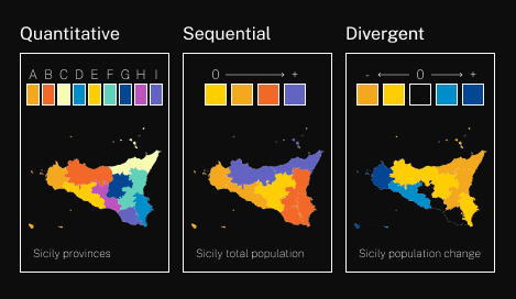
Accessibility: Ensuring inclusivity in design choices.
Creating the Guidelines
Developed templates and best-practice examples for common chart types.
Provided recommendations on colour schemes, typography, and interactivity.


Stakeholder Collaboration & Feedback
Gathered input from researchers, designers, and data analysts.
Iteratively refined the guidelines based on real-world application feedback.
Balancing Detail with Simplicity: Government response data is complex, and presenting it in a digestible format was crucial. We introduced progressive disclosure techniques, allowing users to explore summaries before diving into full reports.
Ensuring Data Integrity & Clarity: Worked closely with researchers to maintain accurate representations of government responses while simplifying presentation for better comprehension.
Stakeholder Alignment: Frequent workshops and feedback sessions helped bridge the gap between UX best practices and research-driven content needs.
Expected Impact
Increased consistency in data visualisations across Minderoo’s reports and platforms.
Enhanced data literacy and understanding among internal teams.
Reduced risk of misinterpretation, ensuring responsible data communication.
Improved accessibility, making data more inclusive for diverse audiences.
Feel free to hit me up. I'm looking
forward to hearing from you.